A Look at Our Energy Consumption
A Look at Our Energy Consumption
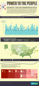
A look at our energy consumption, is probably the furthest thing from your mind, as you are putting away all those Christmas lights. Don’t you sometimes feel like you might actually get ahead of the game, if you weren’t paying so much for your electric bill? Thanks, to this new infographic chart from Credit Sesame, you can now get a better idea of where all that money goes, and how your energy dollars are used. It takes a look at our energy consumption.
 Right now, our electric costs may be the last thing on our minds, as we are putting away our holiday chores and preparations for the end of 2012. But, if you’re like most of us Americans, chances are you’ll get a bit of a shock in the mail when that next bill arrives.
A Look at Our Energy Consumption and How We Consume Energy
This chart, is a look at how we consume energy. It’s not just because of those festive holiday lights, all around your house and yard, that are driving up the cost. It’s everything else we tend to do more of during the winter. Especially, during the holidays, there is more cooking, washing and drying, heating the home, and cranking up the heat on those chilly nights. Even watching TV, or using other electronics, seems to cost more this time of year, perhaps, because we spend more time indoors. We want our homes warm and cozy.
Here in Washington, it seems crazy what we pay for electricity, when we have an abundance of hydro-electric power. Perhaps, we shouldn’t complain much, because other places in the world, are doing without our creature comforts, or they are paying even more, than we are.
A Look at Our Energy Consumption and Your Questions
So, just a few questions for you to ponder and check out on the chart here, about our energy consumption and how we consume energy.
How does your typical monthly electric bill compare to the average in your state? How about the rest of the United States? Where exactly do those kilowatts go? Where is electricity the cheapest? Check out this handy chart for some eye opening information. I hope you have found this information useful, and you are welcome to share your thoughts, here. In more ways than one, here’s hoping 2012 brings Power to the People, as we take a look at our energy consumption!
Related articles
- Infographic: America’s Energy Prices Vs. The World (fastcompany.com)
- Why energy markets prove ultimately unfair (usedthoughts.com)
- How Lighting Effects Your Home’s Energy Consumption (zen.homezada.com)


